Entries in fine art (10)

Wednesday
Mar212012

Darkroom Daze

Whew! Another day, another step closer to getting the upcoming show ready.

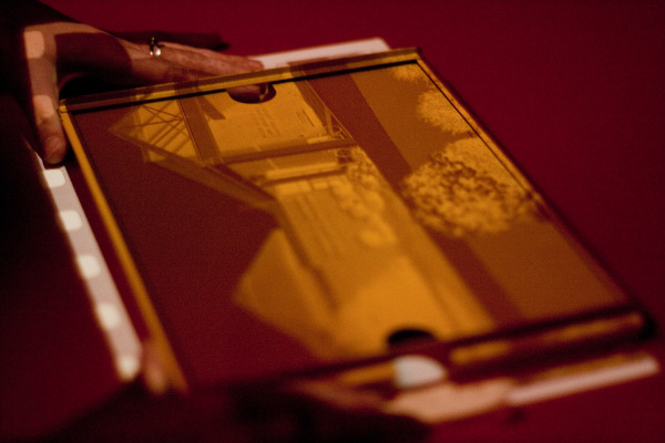
One thing that separates darkroom printing from any modern inkjet equivalent is the extra calibration and control needed to achieve a consistent, cohesive series of images. "Dapper", being my largest solo exhibition to date, I was even surprised just how unprepared I was, for hand printing 30 images of varying size and exposure. In the end, it'll be the quality of the prints that will count, and boy will they have it! All prints are being made on double-weight fiber base silver gealtin paper. After exposure, some requiring some intense dodging and burning, the paper is developed in Kodak Dektol, fixed, washed, selenium toned, and washed again for archival permanence. Another one-up on digital, these prints should see their way through to my nineties, assuming they're cared for reasonably.

When I've got the last round of 8x10's printed and dried, I'll be posting a quick how-to video on selenium toning prints for aesthetic appeal and archival permanence.

P.S. Silver gelatin papers aren't cheap, just check out what they're going for right now! >__<

Thursday
Mar082012

Photo Quote of the Day

"I began to wonder – I knew I was an artist or wanted to be one – but I was wondering whether I really was an artist. I was doing such ordinary things that I could feel the difference. Most people would look at those things and say, “Well, that’s nothing. What did you do that for? That’s just a wreck of a car or a wreck of a man. That’s nothing. That isn’t art.” They don’t say that anymore." 

                                                                                                          - Walker Evans


Wednesday
Feb222012

Split Grade Printing Examples

While souping some 16x20's in the darkroom this evening, I was reminded of a question friend and fellow film photographer Dan Domme (Flickr) asked a few days ago about split grade printing. He was basically wondering how one can print two different grades onto silver paper, and why one would print like that. So, in lazy, not wanting to write up a long blog post, fashion, here's a quick video detailing what split grade printing is, what negatives you should use it on, and some examples. Enjoy!

If you've never tried split grade printing before, all you need is some: variable contrast papers (graded won't work), a contrasty negative, B&W filter set (00-5 preferred), and a little bit of darkroom time, and you're all set. It's very easy to do, and the results are not too shabby! If used with negatives that don't require too much dodging and burning, it's a very easy way to get consistent, contrasty results with silver gelatin printing. Thanks for looking, and hope you can try out this helpful darkroom hint for yourself.